DICTION
A mobile application to help users learn new vocabulary interactively with A.I.
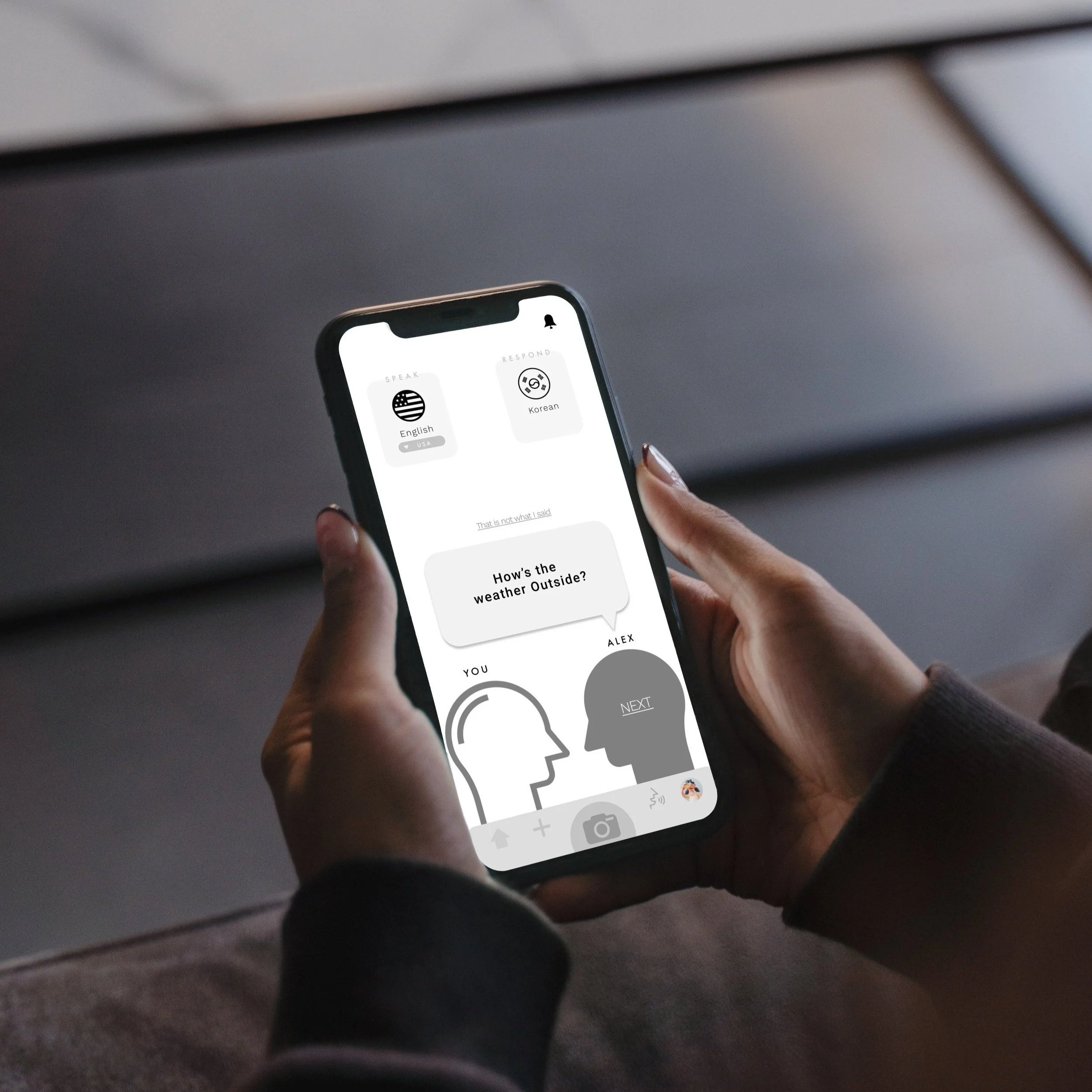
Vocabulary Playground
The problem is vocabulary Learning applications are just really boring. People don’t like the idea of “studying” something, so people tend to look for a more entertaining way of “studying”. That is why Diction was designed to allow users to interact with other users and conversate with A.I. so that users could stay entertained while “studying” the vocabulary at the same time. Users will have fun studying with Diction.


P R O C E S S
1 Competitive Analysis
2 User Research
3 Persona
4 User Flow
5 Prototype: lo+hi
6 User Testing
1 Competitive anlaysis
After investigating four popular vocabulary mobile applications such as Quizlet, Vocabulary, and Word of the day, I noticed that applications with a bigger audience offered more options to learn vocabulary interactively. These options included features such as flashcards, games, and puzzles.
For instance, Quizlet was distinctively successful because it was the first application that offered a stable flashcard feature with an interface that is very easy to follow.

2 User Research
After interviewing 4 people, I was able to confirm that people love to find various interactive ways to learn new vocabulary. Each interviewee had his/her own way of memorizing new vocabulary that is entertaining. They would try to find someone to conversate with using the word, watch related videos, or search the interesting historical facts behind the words.

3 Persona
Creating a persona helped me emphasize with the users on a deep level. It pushed me to analyze why users would download the application, what would help users feel satisfied with the application, and what would make users come back to the application later.

4 User Flow
Creating a user flow helped me study the path that users would take on the application. Sorting out the small steps users would take starting from the entry point to the final action helped me think about the psychology behind each step. It also helped me brainstorm what kind of wireframes I need to include.

5 Prototyping
I like to draw out low-fidelity wireframes on paper by hand before going to the computer. Then, I used the software Figma to transform my sketch into high-fidelity digital wireframes.
Low-Fidelity Wireframes

High-Fidelity Wireframes

6 Usability Testings
4 rounds of usability tests were conducted after creating the test plan and script that includes demographic questions and scenario tasks. Following Revisions were implemented after the tests:

Insert LOG IN logos (Facebook / Google / Apple)
A few of the participants were confused by the single letters. They are used to seeing the logo SVGs.
Make the 'SAVE' button darker
Better color contrast = better readability = better accessibility
Think of the potential ads placement
The application doesn’t run free and I hate pop-up ads, so I should consider leaving some space for ads.
Make Word Reminder icon easier to find
Participants couldn’t find the notification icon on the profile page because it was too deep down. I decided that it would be better to take the icon out of the profile page and fix it on top of the screen.
Make the stacks in the library two rows instead of three rows
I realized I was squeezing too many contents in a small phone screen all at once.
Fix minor design mistakes
Get rid of the (library/profile/setting)sub-menu error
Remove the Glob icon during the 'creating a new flashcard' process
Make the word reminder setting easier to find